React.js Custom Modal Example & Tutorial

In this article, I am going to create a demo for React.js custom modal. For this, I will use here react-modal NPM package.
There are so many other third-party libraries available today, Here I am going to use one of the very popular libraries.
Let's Get Started
Step 1: Create React App
create a very basic app of react.js by using below command over terminal.
create-react-app reactjs-custom-modal
Step 2: Create Modal Component
Create a folder inside src/ folder named modal. Now create two files inside this first modal.js and second, modal.css. Now open modal.js file and add below code in it.
Above, Modal component is a functional component which is receiving the contents as the children of the component. We are having 3 props for showing the modal, closing the modal and children for contents of the modal. Some CSS class has been added in HTML elements whose definition is written inside modal.css which I am going to explain just after it.
Now open the modal.css file and put below code inside it.
Step 3: Update App.js
In the above code, At the top, we have imported the modal component and used in the render method with the values of the props passed to it. After that we can see two custom methods:
1. openModalHandler(): It sets the state of isShowing to true to open the modal.
2. closeModalHandler(): It sets the state of isShowing to false to close the modal.
After that, An onClick listener is passed to the div to controll the opening and closing the modal.
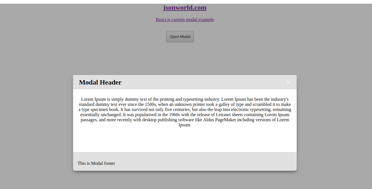
Step 4: Run the app
After all the previous steps, Run the app over terminal with npm start. A new tab will open with url http://locahost. A screen like below will open.
Conclusion
So in this demo, We learn to create custom modal in React.js with very simple steps. You can find other demos of React.js Sample Projects here
That’s all for now. Thank you for reading and I hope this demo will be very helpful to create React.js custom modal.
Let me know your thoughts over the email demo.jsonworld@gmail.com. I would love to hear them and If you like this article, share with your friends.
Find other similar Articles here:
- What are the Different way of using useEffect in React
- How to Get URL Parameters in Reactjs Application
- How to Convert React Web Application to Mobile Application
- React + Fetch - HTTP GET Request Examples
- What are the Different ways to Style React Component
- Client Side Rendering vs Server Side Rendering in Reactjs
Other Articles
-
 Getting Started with react.js
-
Login with Facebook and Google in React App
-
Login with Git and Microsoft in Reactjs Application
-
How to Fetch Data from Third-party API in Reactjs
-
Simple Pagination in React.js App
-
Form Validation in React.js Application
-
Custom Dropdown Selectbox Example in React.js
-
Autocomplete in React.js Example And Tutorial
-
CRUD Application in React Example and Tutorial
-
How to use Axios with ReactJS Application
-
How to use localStorage with React
-
React Radio Button Example and Tutorial
-
Uploading file with React.js and Node.js
-
Basic React User Registration Login App Without Redux Example and Tutorial
-
React + Redux - User Registration and Login Example & Tutorial
-
React 16 Datepicker Example with react-datepicker
-
CRUD Application in React.js with Hooks Example and Tutorial
-
Create Basic React Hooks Application for Fetching List
-
Create Responsive Carousel with React
-
Angular or ReactJS Which is Better in 2019?
-
Getting Started With React.js
-
What is Virtual DOM in React and How Virtual DOM works?
-
Angular vs React vs Vue - A Detailed Comparison
-
Functional and Class Components in ReactJS
-
Different ways of using Bootstrap 4 in React application
-
What are the different ways to make HTTP Request in Reactjs application
-
Conditional Rendering in React Example & Tutorial
-
How to Check Version of React Application
-
How to generate PDF in React.js Application
-
Single and Multiple Image Preview in React Application
-
React onClick Event Handling with Examples
-
Lifecycle methods in React 16
-
How to Display List in Reactjs Example
-
GET Request in React.js using Fetch Example and Tutorials
-
Start Working with React Context API
-
Set up Lazy Loading in React Application
-
Communicate Between Components with Observable Subject in ReactJS
-
What is GraphQL? How GraphQL is different from REST API?
-
How to Deploy React App over Firebase Hosting
-
How to use Interceptor with React to set Auth header with API request
-
Show Loading Spinner after Submit with React Hook Form
-
What are the limitations of ReactJS?
-
What are the Different Ways to Optimize a Reactjs Application
-
Client Side Rendering vs Server Side Rendering in Reactjs
-
What are the Different ways to Style React Component
-
React + Fetch - HTTP GET Request Examples
-
How to Convert React Web Application to Mobile Application
-
How to Get URL Parameters in Reactjs Application
-
What are the Different way of using useEffect in React