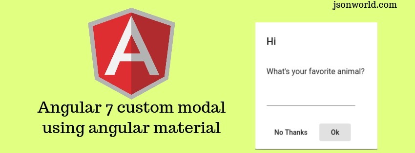
Angular7 Custom Modal Using Angular Material Tutorial

Angular has come a long way after its version 2, and now with many more libraries and tools to help with the development than ever before. In this article, I will create a demo to make you understand about how we can create custom modal in angular using angular material using Angular-CLI.
Let's Get Started
Step 1: Create Angular project
ng new angular7-custom-modal
Step 2: Install angular material and other dependency libraries
npm install --save @angular/material @angular/cdk
Step 3: Create home component
ng g c home
Step 4 : Update home.component.ts file
open the home.component.ts file and update the below code in it.
For the simplicity, I am doing everything in very less file, You can see I have created Chat modal component here only. Normally while development we should create this as service so that it can be used at multiple component. But here I am going to make everything in very briefly.
Step 5: Create html file for chat modal
As I told just before that I will go in very brief way, So create a file inside home componet folder named main-chat-modal.html and put the below code in it.
Step 6: Import pre-built theme css file
import below file in styles.css file placed under src folder.
@import '~@angular/material/prebuilt-themes/indigo-pink.css';
step 7: Update home.component.html file
Open home.component.html file and put below code inside it
Step 8: Update routes
Open app-routing.modal.ts file
const routes: Routes = [ { path: '', component: HomeComponent }];
Step 9: Update app.module.ts file
Open app.module.ts file and put below code
Step 10: Run the app
Run the app with ng serve over terminal.
Conclusion
So in this demo, We created a very basic demo to use the angular material library for the angular custom modal. For reading more about angular material modal click here
That’s all for now. Thank you for reading and I hope this demo will be very helpful to understand how to use angular material for custom modal.
Let me know your thoughts over the email demo.jsonworld@gmail.com. I would love to hear them and If you like this article, share it with your friends.
Thanks!
Find other similar Articles here:
- Different Ways to Optimize Image in Angular Application
- Display Array Items over template in Angular Application
- Use HTTP Interceptor to Set Auth Header for API Requests with Angular
- Different ways to get form data in Angular Component
- How to Add Script Dynamically in Angular Application
- How to Use Absolute Paths For Module Imports in Angular